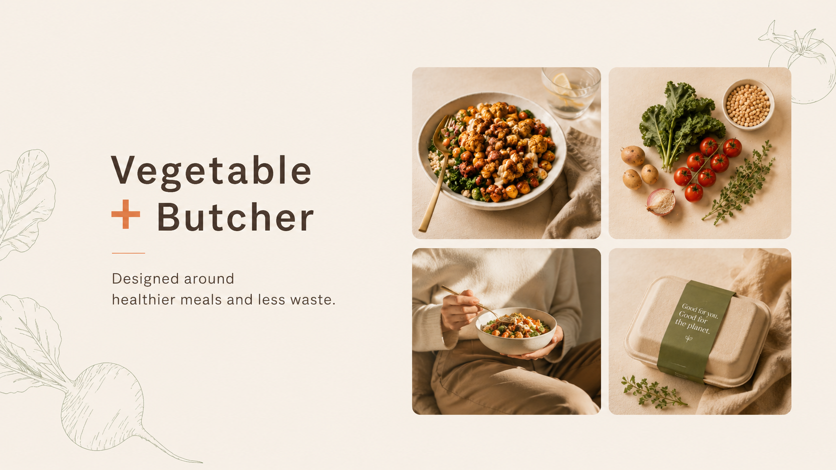
Vegetable + Butcher
Turning a closed-loop business model into an investor story.
Introduction
Cluster is an AI-powered A/B testing platform built for Shopify brands. It helps e-commerce teams run smarter experiments and act on results faster, with an interface designed for marketers rather than data scientists.
Brand, Design, Development
10 weeks
TL;DR
Problem
Shopify brands evaluating A/B testing tools need to see credibility and results fast. Cluster's previous site didn't close that gap. The platform was more capable than its competitors, but the site wasn't making that case.
Solution
Premium visual identity and a focused conversion flow. Subtle Shopify UI references for familiarity, real outcome data for trust, CTA architecture built around demo bookings.
- Used subtle Shopify UI references to create instant familiarity with the target audience
- Led with outcome data — real numbers from real stores — before any feature explanation
- Built the logo and identity to own a visual space that no other testing tool occupies
- Designed the CTA architecture around demo bookings as the primary conversion goal
Preview
What the work looked like
User Research
Three distinct audience groups, same core tension — the existing experience wasn't built for how they actually work.
01
Shopify Brand Owners
- Running 7–8 figure stores and scaling aggressively
- Need A/B testing that's fast to set up and easy to read
- Compare tools by how quickly they can show revenue impact
02
E-commerce Growth Managers
- Running continuous experiments across CRO and paid channels
- Need a tool that surfaces statistical significance without a data analyst
- Evaluate platforms by how well they integrate with existing stack
03
DTC Founders
- Making every decision themselves across product and marketing
- Need the tool to feel familiar — Shopify-native, not foreign
- Convert when they see real numbers from real stores like theirs
Problem Statement
How might we make Cluster feel like the obvious choice for Shopify brands before they've even booked a demo?
Shopify brands evaluating A/B testing tools need to quickly see credibility, results, and a clear path forward. The website and visual identity were built to present Cluster as a premium solution and make its value easy to understand from the first visit.
A clear structure, subtle Shopify-inspired UI references, and a focused conversion flow helped build trust and highlight real outcomes. As a result, the site supported qualified demo bookings and became a key driver for growth.
Core Flows
Premium visual identity and a focused conversion flow. Subtle Shopify UI references for familiarity, real outcome data for trust, CTA architecture built around demo bookings.
A clear structure, subtle Shopify-inspired UI references, and a focused conversion flow helped build trust and highlight real outcomes. As a result, the site supported qualified demo bookings and became a key driver for growth.
Brand Identity
The logo and identity were built to own a visual space that no other A/B testing tool occupies. Subtle Shopify UI references created instant familiarity. Outcome data from real stores led the narrative — numbers before features, always. The CTA architecture was designed entirely around demo bookings as the single conversion goal.
Impact
10wk
Brief to launch
↑
Demo bookings
↑
Outbound conversion
Qualified demo bookings increased. The site became the primary sales artifact in outbound and a key driver for the company's growth phase.
Key Learnings
01
For conversion-focused tools, the site itself needs to demonstrate conversion thinking
Structure, hierarchy, and CTA placement are as important as the visual design.
02
Familiarity is a shortcut to trust
Shopify merchants recognised the UI language immediately — which made Cluster feel like something they already understood.
03
Outcome data is the most powerful copy
A real number from a real store outperforms any product description by a factor of ten.