Dono
Creating a brand people can recognize.
Introduction
Specter is a data tracking platform that gives product teams visibility into their users' behaviour across every touchpoint. It surfaces insights that most analytics tools miss, with a focus on actionable data over raw metrics.
Web Design
7 weeks
TL;DR
Problem
Specter tracks things competitors can't, but the product's breadth made it hard to explain. Without a clear visual narrative, visitors left before understanding the value. The site needed to do the job of a sales demo.
Solution
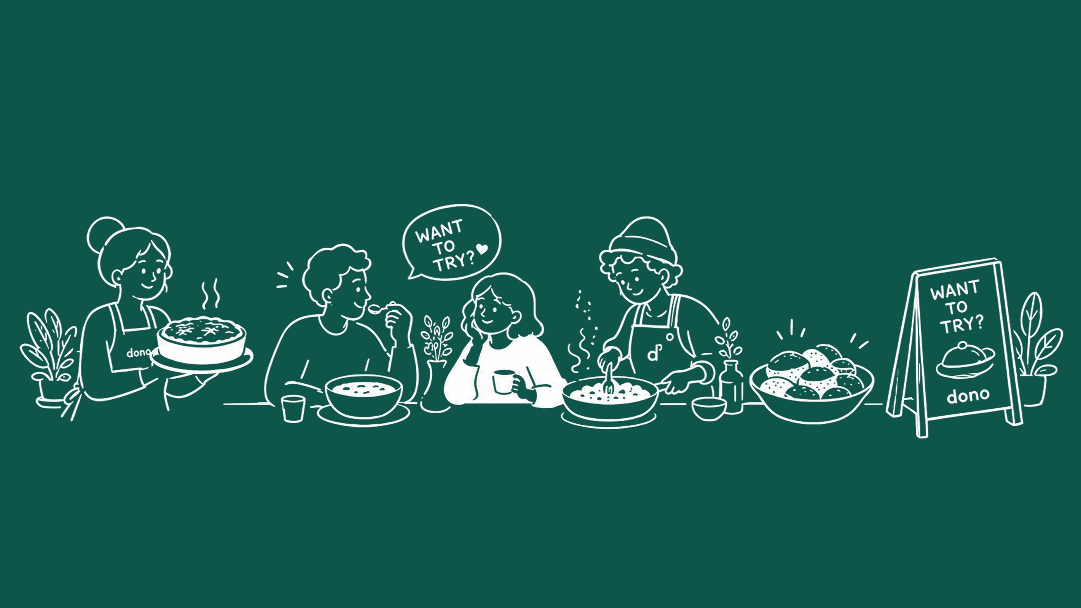
Unified visual language across the site — one system, not a stack of feature pages. Custom illustrations made the tracking mechanisms legible at a glance.
- Built a unified visual language across all feature pages — one system, not a stack of modules
- Used custom illustrations to make tracking mechanisms legible without screenshots
- Prioritised the 'what does this mean for me' question over feature depth on every page
- Created a narrative arc: problem surface → Specter sees it → here's what you do with it
Preview
What the work looked like
User Research
Three distinct audience groups, same core tension — the existing experience wasn't built for how they actually work.
01
Product Managers
- Need visibility into user behaviour across every touchpoint
- Want actionable insights, not raw metric exports
- Compare tools based on how fast they can surface answers
02
Growth Engineers
- Building funnels and attribution models
- Need tracking that captures what standard tools miss
- Judge platforms by how quickly they can get to production
03
Startup Founders
- Wearing multiple hats across product and growth
- Need a single source of truth without a data team
- Evaluate tools by whether the site explains it without a demo
Problem Statement
How might we make Specter's tracking depth legible to visitors in under 30 seconds — without a demo, without jargon?
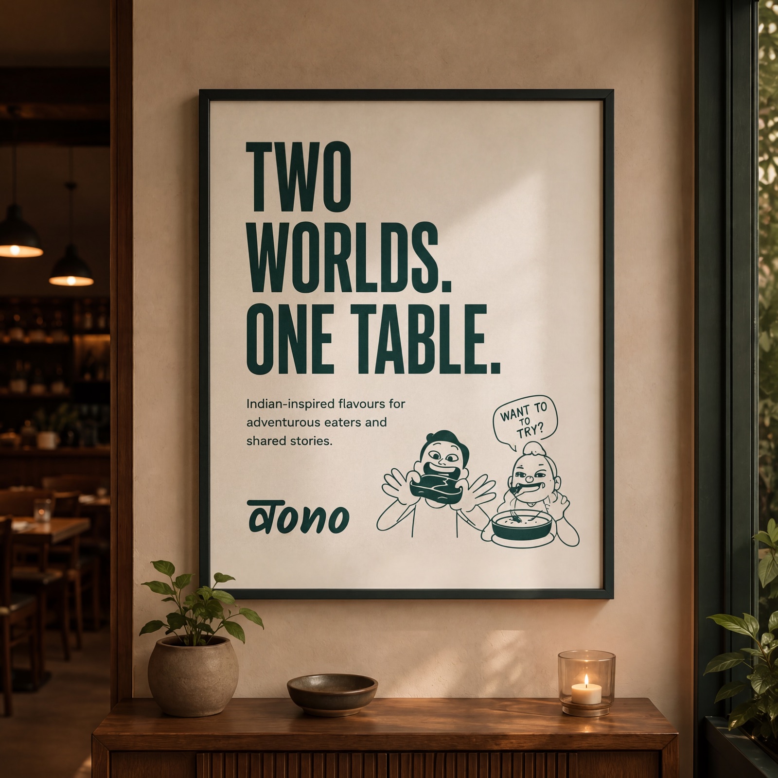
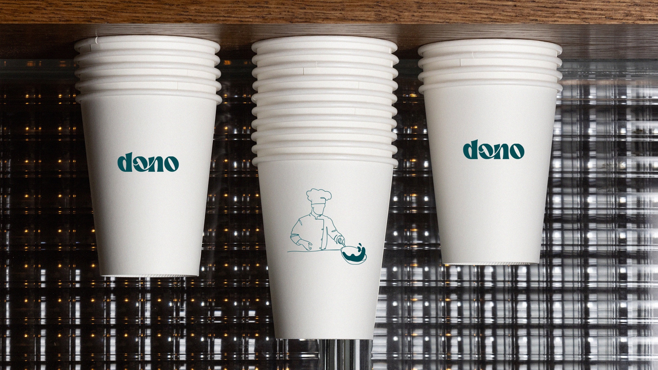
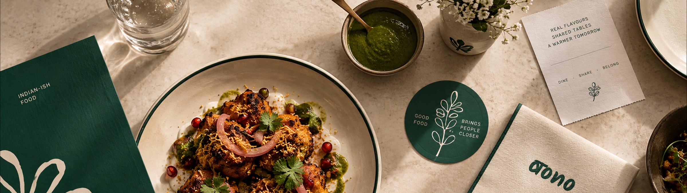
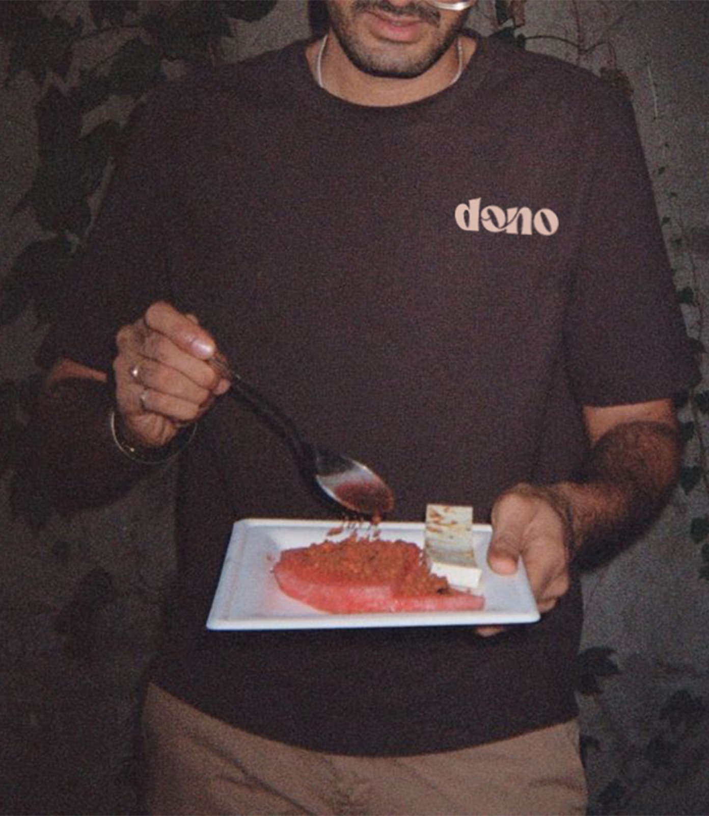
The goal was simple: make Dono feel like itself. I worked across identity, art direction, digital, and the brand deck to build a system that could stay consistent without getting boring.
Core Flows
Unified visual language across the site — one system, not a stack of feature pages. Custom illustrations made the tracking mechanisms legible at a glance.
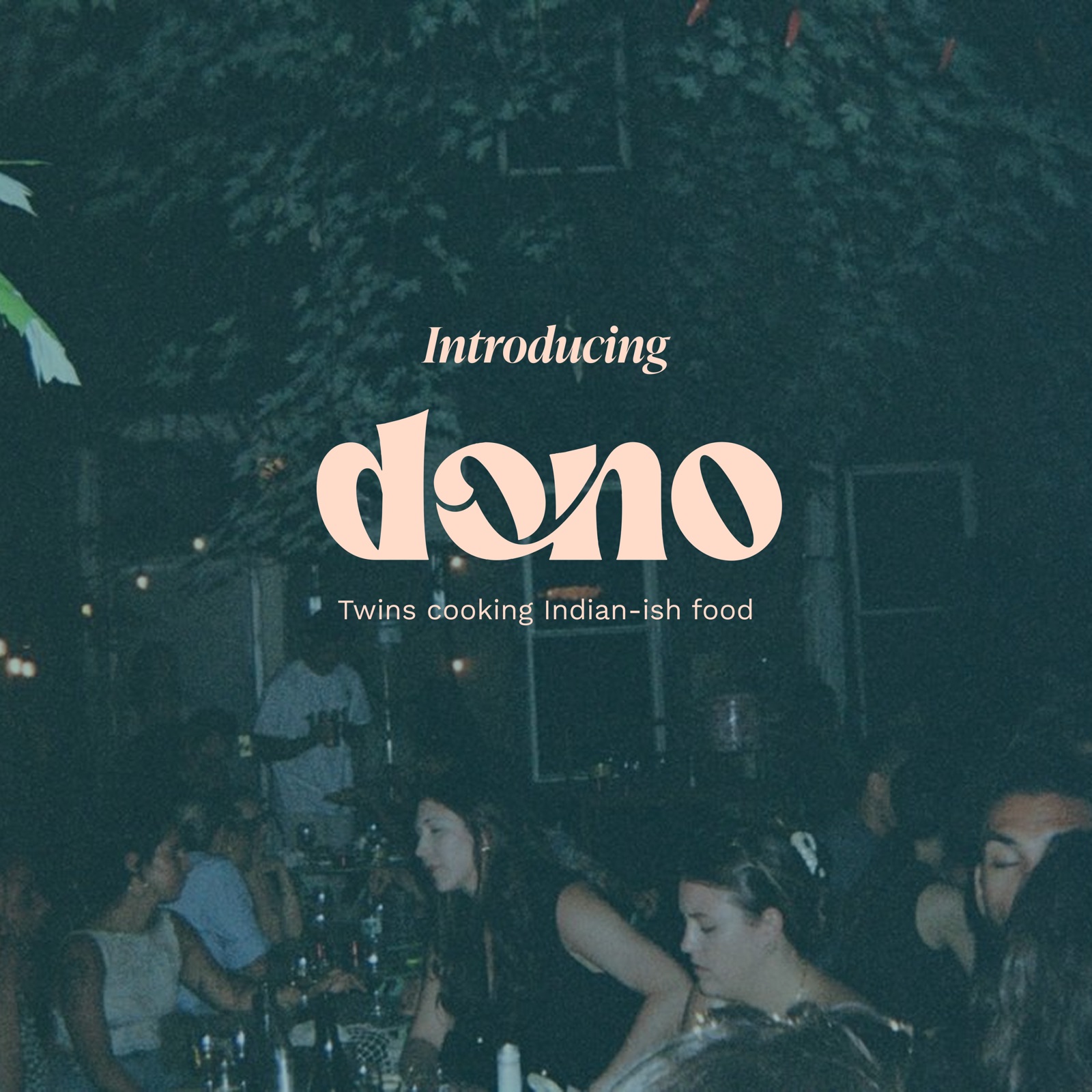
The goal was simple: make Dono feel like itself. I worked across identity, art direction, digital, and the brand deck to build a system that could stay consistent without getting boring.
Brand Identity
The site had to replace the sales demo. I built a unified visual system across every feature page — one illustration style, one layout grammar, one narrative arc. The design doesn't describe features; it walks visitors through the problem they already have.
Impact
7wk
Design to ship
↑
Key page conversion
↓
Sales cycle length
Higher conversion across key pages. The clarity of the site gave the sales team a better starting point for every conversation.
Key Learnings
01
Complexity isn't the same as depth
The most technical products often benefit most from the most careful simplification.
02
A unified visual language isn't a nice-to-have — it's what makes a multi-feature product feel like one coherent thing.
03
The site that does the demo's job for free is the most valuable sales asset a startup can have.